Situation
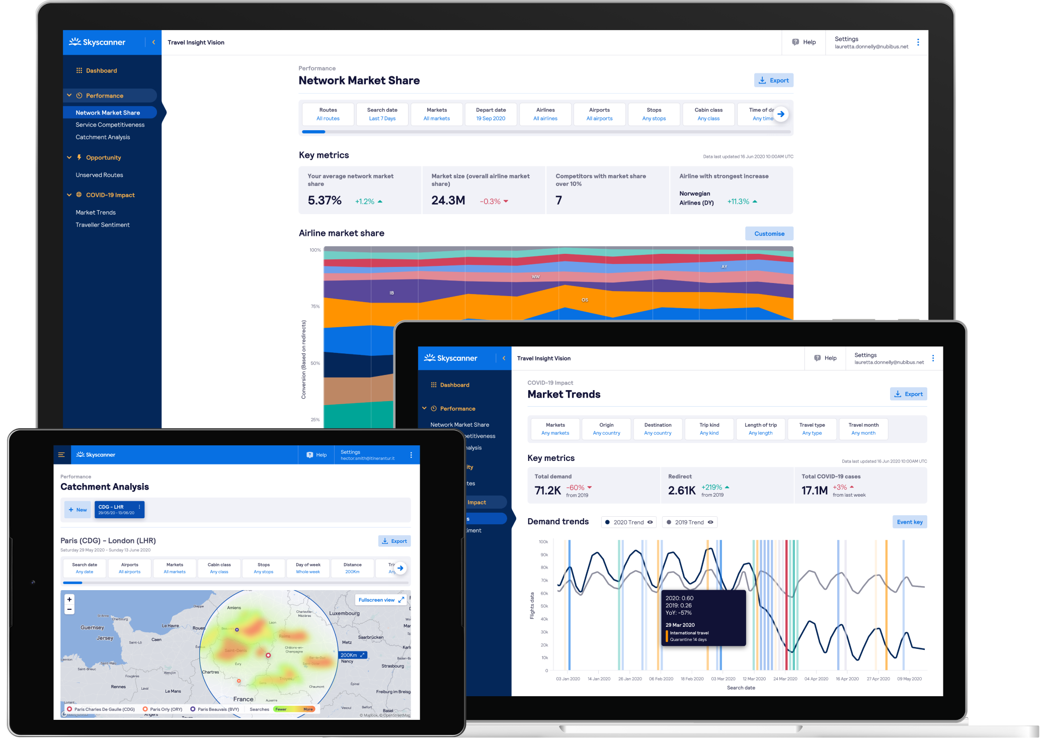
Skyscanner aggregates a tremendous amount of travel data from its customers. This is offered as a data product for the partners it works with; airlines, hotels and online travel agents. In 2019 I worked with the data products team to improve the user experience for their existing products, as well as design a new data product called Travel Insight.
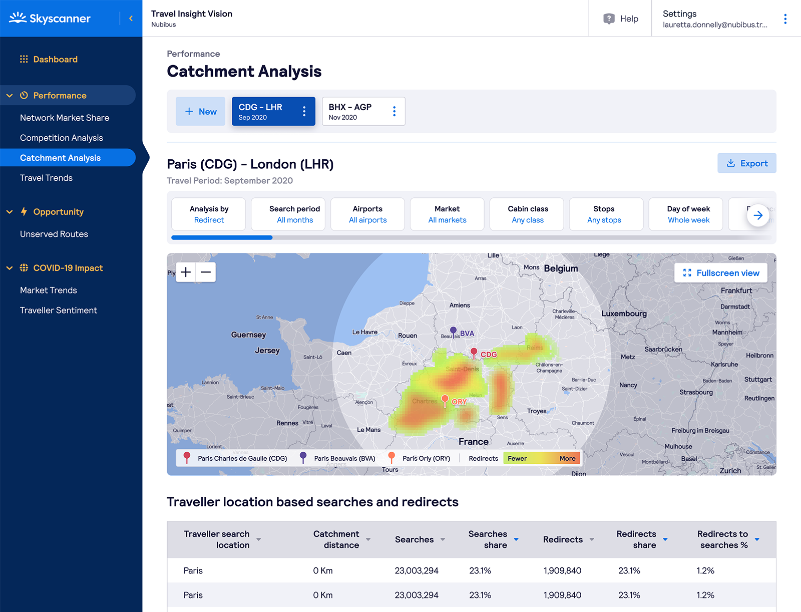
The platform that supports Skyscanner’s data products is nominally owned by the squads I worked with, but it allowed contributions from across the business. Features would be added by squads with varying front-end experience, often without a designer. In many cases they would deal with their own use-case, and rarely test outside of it.
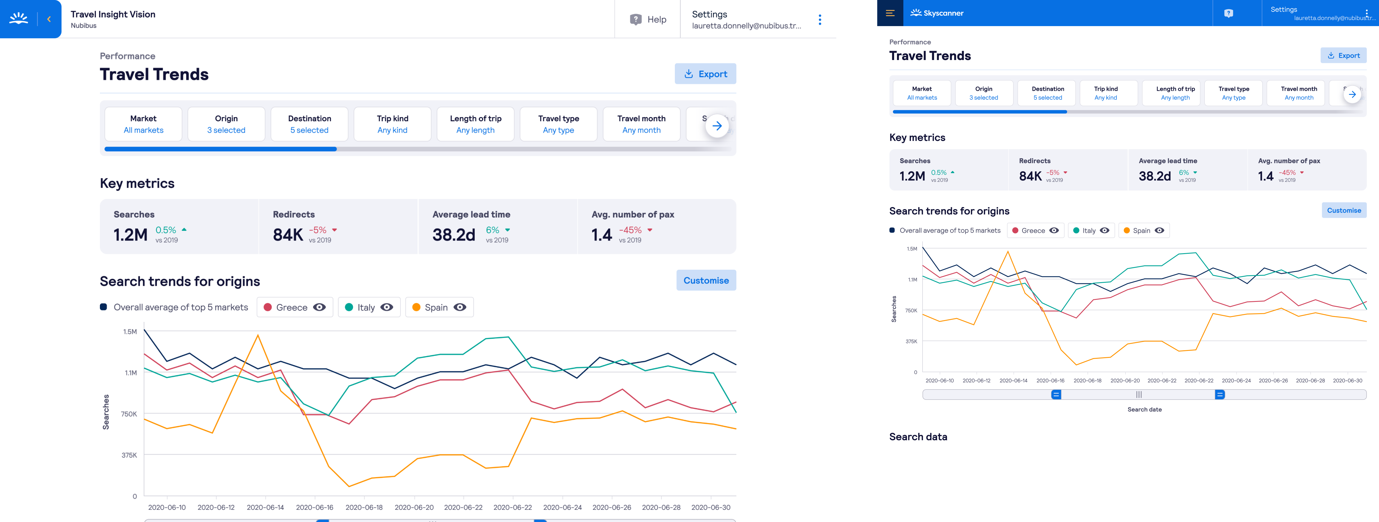
As a result, consistency of experience was suffering. Within one product there were different ways to filter, different page structures, and different standards of accessibility.
Task
Redesigning the entire product wasn’t feasible; several of the pages were in maintenance mode and not being updated. For other teams their roadmap didn’t allow for updates. My own team had a strict roadmap for delivery, and didn’t have the time to start fixing all the pages.
Instead I decided to focus on enabling product owners and engineers to design better products. As new features replaced old ones, the quality bar would increase.
The goal was to understand what resources would have the most impact for that group and to deliver them in an easily accessible format.
Action
The first stage of the process was exploring the problem space. I spoke to product owners and engineers in squads who’d recently contributed code in Git, and worked to understand how they approached design in their development process. I also tried to understand what format of resources would be most useful.
For engineers they preferred clear documentation; do’s and don’ts, and prescriptive guides that helped them understand the right component to use. Product owners were more interested in processes they could follow early on as they scoped their products. Both described an interest in the ‘right’ way to solve a problem; what graph to use in what situation, or how best to do filtering.
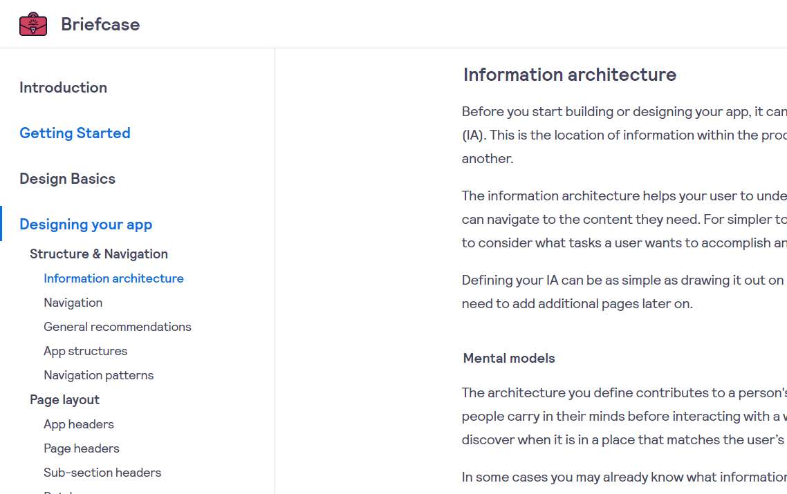
Following on from this I began drafting a set of interface guidelines focussed on the basics of design, through common screen patterns, and ways to structure an interface to accomplish a specific goal.
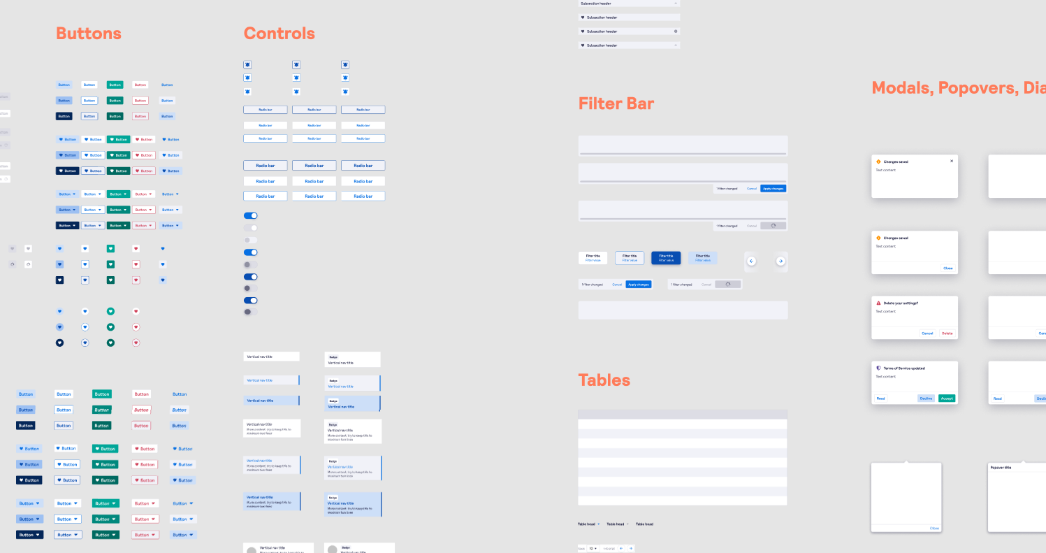
This was supported with a component library, created in Figma but outputted as static assets for Miro, that would allow for quick wireframing but also establish a common visual language between product owners and engineers.
Separately I coordinated with the Design System team to understand where this guideline would fit in. Skyscanner’s design system has historically been B2C & mobile first, and I was keen to incorporate some of the learnings from our B2B desktop-focussed data product. I worked closely with the team to suggest approaches that let us lean on the design system, whilst allowing for a bespoke approach for data products, citing examples from Spotify’s hub and spoke DS model.
Result
With my product owner I was able to provide a clear shorthand for the creation and discussion of new screens. Rather than sketching out a unique approach for each screen, we could lean on the established patterns from the guideline and pattern library.
Unfortunately I left Skyscanner before I could see any impact on engineers from this initiative, although they were positive about the content of the guidelines and provided feedback throughout the creation process.
Finally in an expected benefit I was able to onboard new designers into the team more easily as the thinking behind each component was clearly documented. Rather than relying on static mockups in Figma, there was a paper trail and reasoning behind the base components in the product. This helped to provide detail on the behaviour of each component beyond what lived in Figma, as well as the higher-level principles that underpinned the data product itself.
Check out the draft version of the guidelines here.