Projects
Building Green Products
Situation
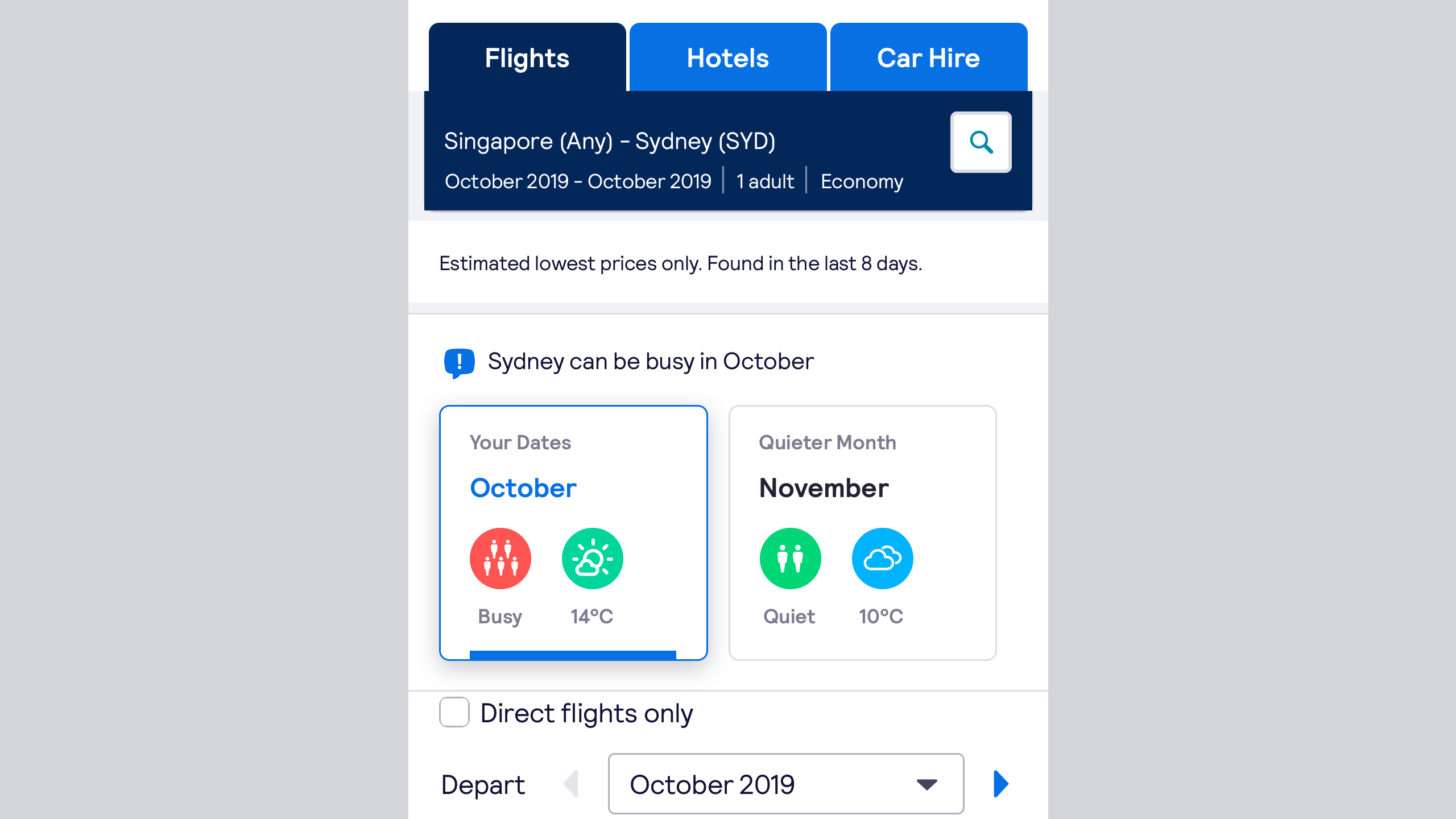
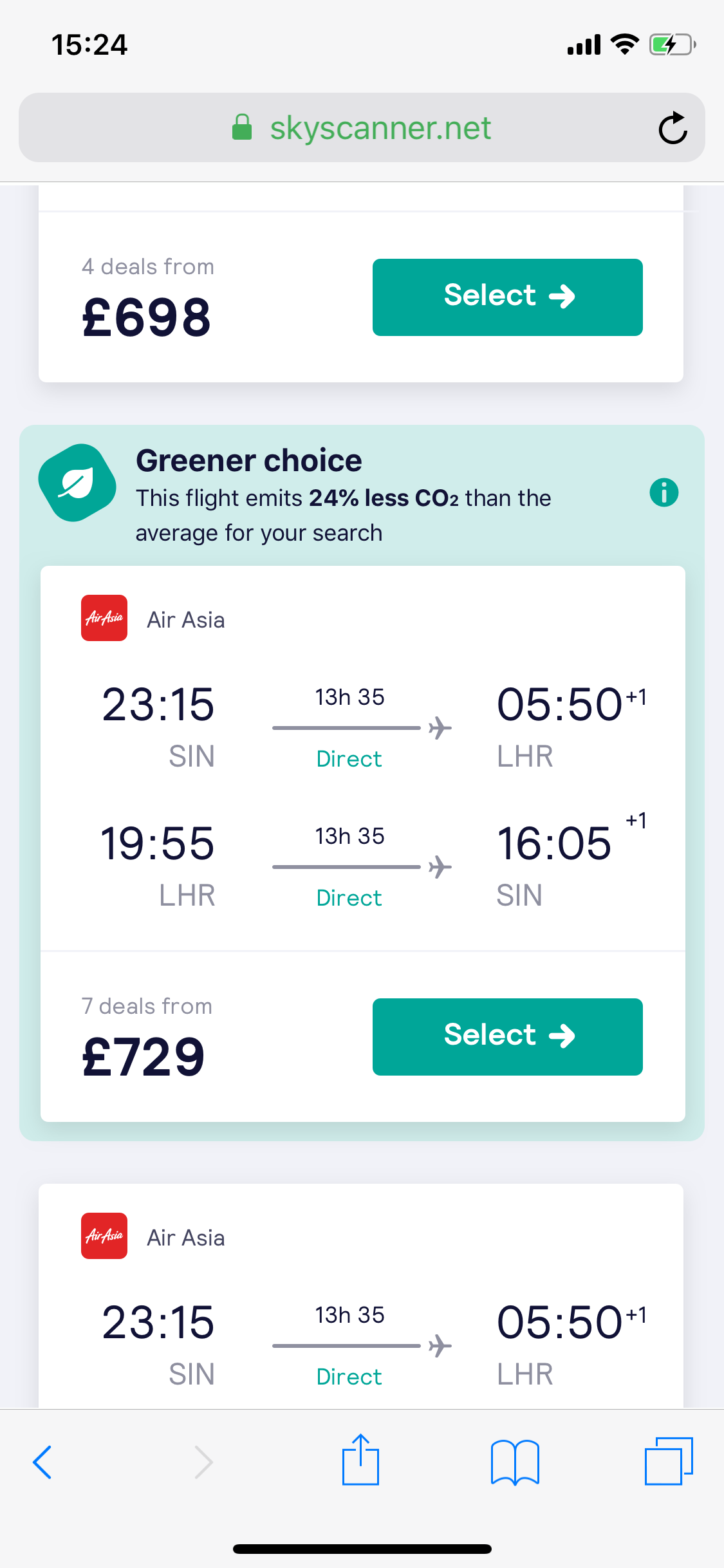
Flying to new and interesting places broadens the mind, lets us relax; but it also contributes rather heavily to global emissions. Knowing that they were contributing to this by encouraging people to fly, Skyscanner decided to fund a team focussed on sustainable travel. I joined this team as design lead, and worked to scope out the problem space to identify areas we could deliver solutions.
Our goal as a team was to explore as widely as possible rather than productionising features, learning as much as possible as quickly as possible. Our product roadmap was relatively fluid as a result, using techniques like Belief Exploration Trees to create multiple areas to explore linked to a core hypothesis.
Reaching those hypotheses meant understanding the industry, as well as how people perceive sustainability. What made this an interesting problem is that people aren’t always entirely honest about how eco-friendly they are.

A set of user interviews had been conducted before I joined the squad. As well as this we captured user sentiment through social media, and would track reactions that specifically mentioned our eco related features. What was interesting was that whilst our user interviews were roundly positive, with people claiming they’d always use our features, in reality takeup was a lot less enthusiastic.

Task
With the assumption that face-to-face user interviews weren’t capturing the full picture, and knowing we were delivering features globally, I wanted to establish whether there were any archetypes that existed in relation to sustainable travel. I also wanted to create a common language that could be used by other teams like marketing and copywriting to describe how our users felt about sustainability. This would better help inculcate the concept of sustainability across the business, and join up user journeys.
User interviews are a great way to capture a wide variety of information, but don’t allow for scale. For this reason, and to consistently structure the information across markets, I opted for surveys. Skyscanner has many millions of MAUs which provided a vast, free user base we could easily rely on.
I worked closely with our copy team and research teams to make sure that the survey didn’t lean too heavily towards eco, asking respondents to prioritise different elements of their trip depending whether they were browsing, planning, or booking. People had told us that eco-friendliness was important, but we could see precisely how high up the rankings it came.

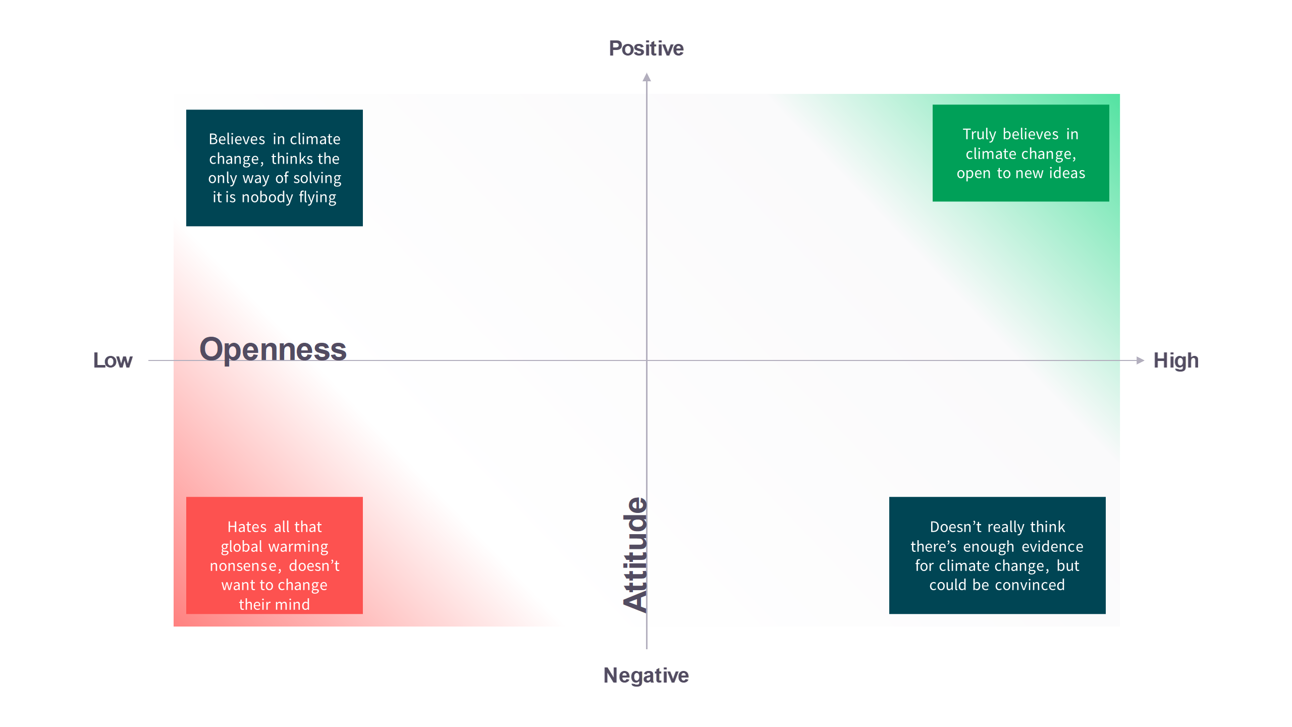
Since we wanted to develop archetypes, I created a matrix that balanced eco-attitudes with how entrenched someone’s beliefs were. This would let us plot not just people who did or didn’t like eco-friendly options, but also those on both sides who were open to new ideas. This tied into prior work I’d done on a framework for changing people’s attitudes towards sustainable travel. The goal was that if we could map out how people felt about sustainable travel, we could change how we talked to them depending on where they were in the world, and any signals we could identify; for example, if people in the US were less interested we could focus on parallel benefits of a lower pollution plane like it being newer.
Action
With the survey created I secured budget to run it across multiple markets, and worked closely with marketing managers in those markets to create faithful translations, and make sure they were aware I was running the research. This built bridges and made sure that they didn’t feel I was overstepping bounds.
I phased the launch of each survey, making sure to run them for a minimum of a month long business cycle in order to capture the different types of traveller on the site. As each survey finished, I collated the results and presented back to multiple stakeholders in Product, PR, Marketing, and Design.
Result
By launching this survey as Skyscanner began a rebrand project I was able to provide timely insights to support sustainability as one of our brand pillars. The PR and Brand teams were particularly interested in how the data could be shared to promote our sustainability features.
As the results came in for each market, I worked with them to understand the results. Separately they looked for secondary research that could validate the insights with people who weren’t Skyscanner users, letting us see how different our userbase was from non-users, which would support acquisition messaging.
Finally the methods I used were shared across the team, and supported Skyscanner’s researchers to conduct similar tests during COVID.