About
Compared to traditional hotel APIs, Impala's goal was to move past the impersonal world of selecting rooms and rates based solely on price. Our product was capable of letting people browse and explore rooms in a hotel, choosing somewhere that fit their needs with unique pricing to match. Prefer a room by the lifts for easy access, or somewhere with an amazing view? We could do that.
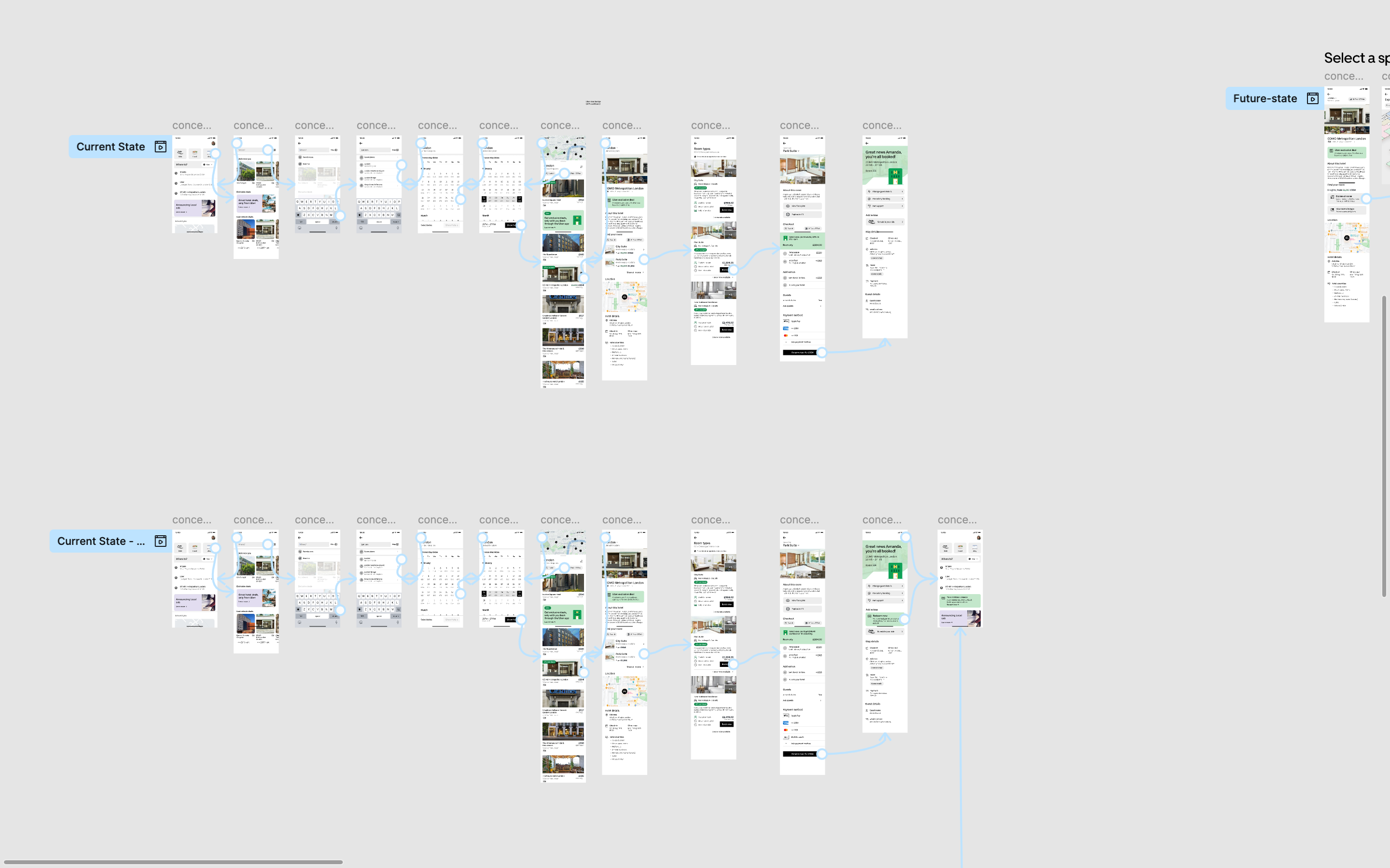
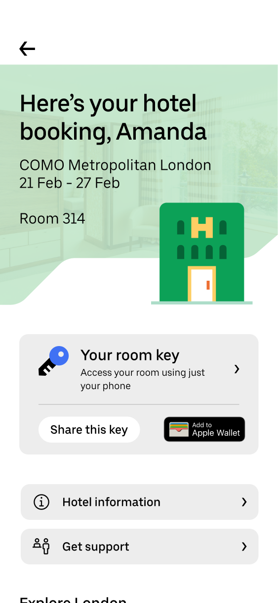
I was part of the team that pitched our offering to Uber. The goal was to create a rich prototype experience that showed what we could offer now, and what the future of our technology could enable. This included direct hotel negotiations, powerful room selection, and integration of new technology like keyless entry and contactless check-in/ out.
Working with the CTO and Head of Sales, I worked not only on the narrative, but also how our technology would enable new experiences.
Context
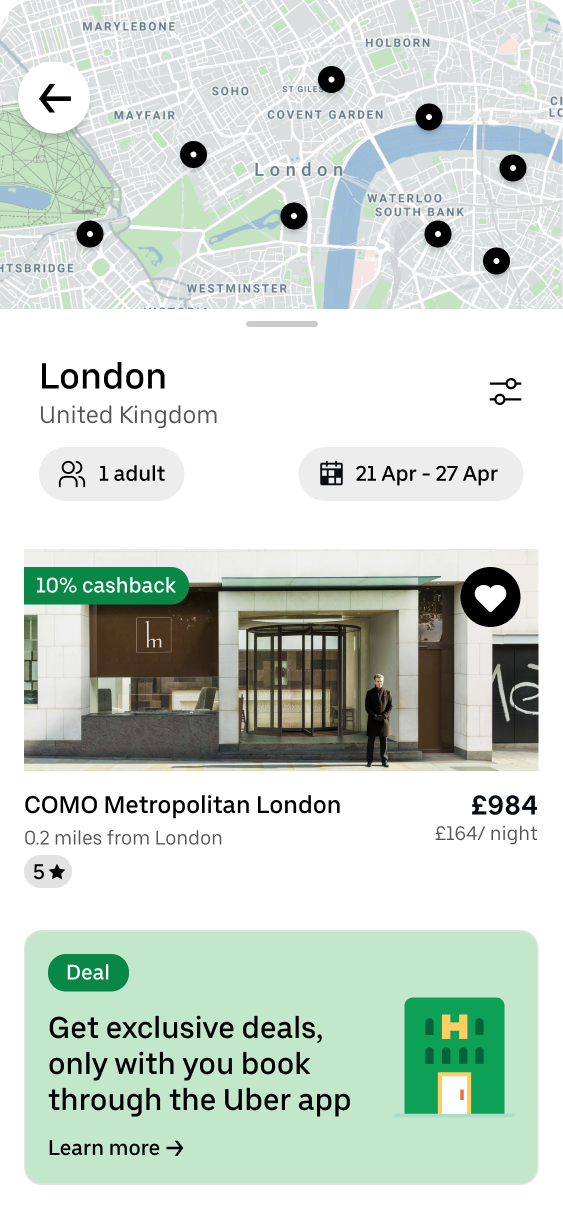
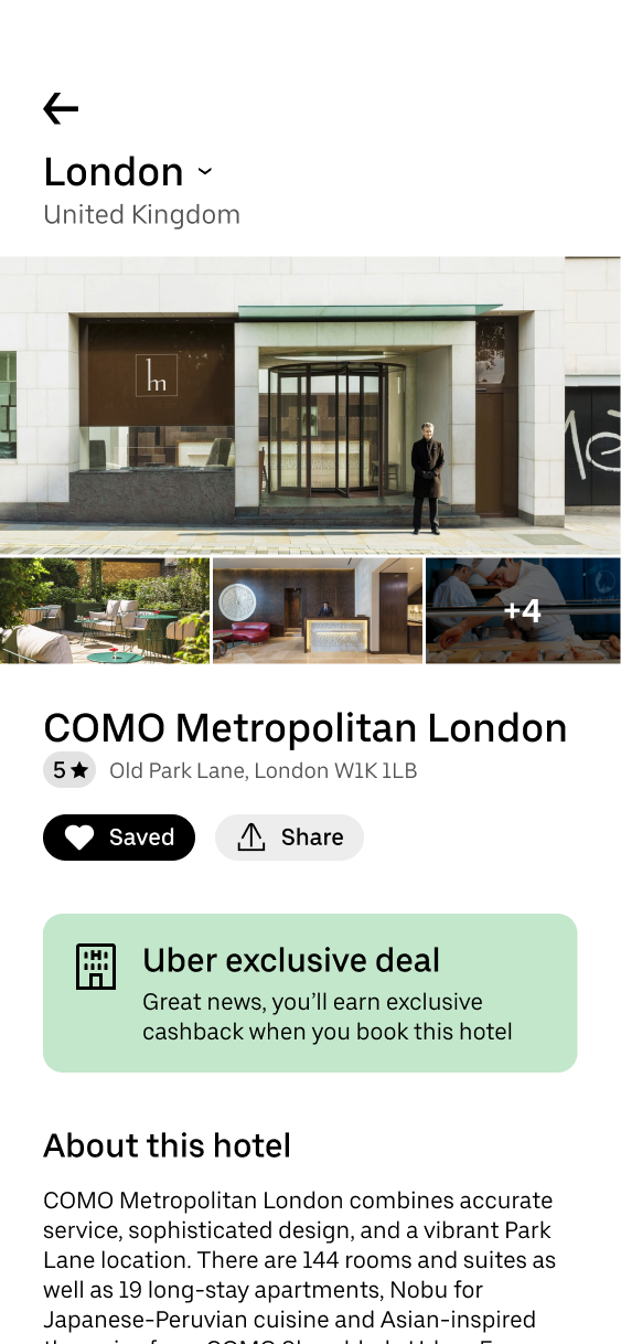
Each prototype was part of a story about what Impala's unique technology could enable for Uber. By enabling direct negotiation between Uber and hotels, they would be able to secure unique rates and discounts which could be passed to their customers in the shape of a cashback program. The prototype takes people through the booking journey, where it was important to highlight that Impala provided hotel imagery and rich content.
Context
Moving from the current state to the future, we wanted to highlight the unique features we could offer. Direct room selection, 3D room tours, and contactless check-in tied directly to your Uber ride. The goal was to create an experience that felt seamless and tied to Uber's offering.


